
This feature visual introduces the core ideas behind ARIA roles, states, and properties. Images are compressed for fast loading.
Quick Guide to ARIA Attributes in HTML: 15 Proven Wins
By Morne de Heer, Published by Brand Nexus Studios
If you want a fast, reliable way to make custom UI accessible, this quick guide to ARIA attributes in HTML has your back. You will learn what to use, when to use it, and how to avoid common mistakes that break screen readers.
We keep things practical. You will see patterns, markup, and testing steps you can apply today. We also touch on page speed with image compression and smart caching so your accessible UI stays snappy on mobile.
Prefer real-world project help as you read? The website design and development team at Brand Nexus Studios builds accessible interfaces that look great and perform well.
What ARIA Is And Why It Matters
Start with a simple idea. ARIA adds machine-readable meaning to custom HTML so assistive technologies can announce the right thing at the right time. That is the core promise behind every quick guide to ARIA attributes in HTML.
ARIA does not replace semantic HTML. It fills gaps. A real button already provides name, role, and state. A div pretending to be a button needs help. ARIA gives that help when you cannot use a native element.
- ARIA stands for Accessible Rich Internet Applications.
- Use it to declare roles, states, properties, and relationships.
- Always prefer native HTML before adding ARIA.
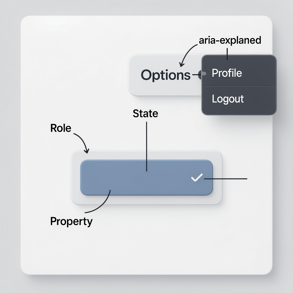
Core Concepts: Roles, States, Properties
Hook into the accessibility tree with three building blocks. Roles tell assistive tech what an element is. States and properties add dynamic meaning like expanded or required. A solid quick guide to ARIA attributes in HTML always starts here.
Roles
Roles define the widget or landmark type. Examples include button, tab, dialog, navigation, main, and status. Screen readers rely on roles to set expectations for behavior and keyboard support.
States and Properties
States change over time, like aria-expanded or aria-checked. Properties describe fixed traits, like aria-labelledby. You will often toggle states in JavaScript while leaving properties static.
<button
  aria-controls="details-1"
  aria-expanded="false"
  id="toggle-1">Details</button>

<div id="details-1" role="region" aria-labelledby="toggle-1" hidden>
  <p>Here are more details...</p>
</div>
Landmark Roles That Boost Navigation
Give users a map. Landmarks let screen reader users jump between regions without slogging through every element. A quick guide to ARIA attributes in HTML has to highlight these first because they improve navigation immediately.
- banner – site level header
- navigation – primary or secondary nav regions
- main – primary page content
- complementary – supporting content like a sidebar
- contentinfo – site level footer
- search – a search form region
<header role="banner">...</header>
<nav role="navigation" aria-label="Primary">...</nav>
<main role="main">...</main>
<aside role="complementary" aria-label="Sidebar">...</aside>
<footer role="contentinfo">...</footer>
Widget Patterns You Will Use Weekly
Focus on common patterns. If you master these, your quick guide to ARIA attributes in HTML will pay off every sprint. Each example favors native elements first, then adds ARIA where needed.
Buttons and Toggles
Use a real button. Toggle aria-expanded on click. Point aria-controls to the panel id. Avoid role=”button” on divs unless you handle keyboard and focus fully.
// HTML
<button aria-expanded="false" aria-controls="more-1" id="more-btn-1">More options</button>
<div id="more-1" role="region" aria-labelledby="more-btn-1" hidden>...</div>

// JS
const btn = document.getElementById('more-btn-1');
const panel = document.getElementById('more-1');
btn.addEventListener('click', () => {
  const expanded = btn.getAttribute('aria-expanded') === 'true';
  btn.setAttribute('aria-expanded', String(!expanded));
  panel.hidden = expanded;
});
Accordions
Structure each header with a button that controls a panel. Mark the panel as a region and connect it with aria-labelledby.
<h3>
  <button aria-expanded="false" aria-controls="acc-panel-1" id="acc-btn-1">Shipping</button>
</h3>
<div id="acc-panel-1" role="region" aria-labelledby="acc-btn-1" hidden>...</div>
Tabs
Tabs require roles and relationships. Set role=tablist on the container, role=tab on each tab, and role=tabpanel on each panel. Tie them together with aria-controls and aria-labelledby.
<div role="tablist" aria-label="Settings">
  <button role="tab" aria-selected="true" id="tab-gen" aria-controls="panel-gen">General</button>
  <button role="tab" aria-selected="false" id="tab-sec" aria-controls="panel-sec">Security</button>
</div>
<section role="tabpanel" id="panel-gen" aria-labelledby="tab-gen">...</section>
<section role="tabpanel" id="panel-sec" aria-labelledby="tab-sec" hidden>...</section>
Modals and Dialogs
Use role=dialog for custom modals. Ensure focus moves into the dialog, is trapped inside, and returns to the trigger on close. Provide aria-labelledby and aria-describedby for context.
<div role="dialog" aria-modal="true" aria-labelledby="dlg-title" aria-describedby="dlg-desc">
  <h2 id="dlg-title">Confirm action</h2>
  <p id="dlg-desc">This cannot be undone.</p>
  <button>Cancel</button> <button>Confirm</button>
</div>
Menus
Prefer native select for simple choices. For complex app menus, use role=menu, role=menuitem, and handle arrow key navigation carefully. Test with a screen reader to confirm announcements.
Live Regions For Dynamic Feedback
Announce changes without stealing focus. aria-live tells screen readers to read content when it changes. In a quick guide to ARIA attributes in HTML, live regions are a must for form errors, toasts, and status messages.
<div role="status" aria-live="polite" id="status"></div>

<script>
  const status = document.getElementById('status');
  function save() {
    status.textContent = 'Saving...';
    setTimeout(() => {
      status.textContent = 'Saved successfully';
    }, 1000);
  }
</script>- polite – announce when convenient
- assertive – interrupt current speech
- off – no live announcements
Naming Things: aria-label, aria-labelledby, aria-describedby
Give every control a clear name. If visible text exists, reference it with aria-labelledby. If not, use aria-label for a concise programmatic name. aria-describedby adds helpful detail without changing the name.
<label id="email-lbl" for="email">Email</label>
<input id="email" type="email" aria-labelledby="email-lbl" aria-describedby="email-help" />
<div id="email-help">We will never share your email.</div>
Avoid redundant labels. If a visible label is present, do not also set aria-label to a different value. That creates confusion in screen readers and defeats the purpose of any quick guide to ARIA attributes in HTML.
Form Validation That Speaks Clearly
Communicate errors with both visuals and semantics. Mark invalid fields with aria-invalid and tie error messages to fields using aria-describedby. Announce summary messages via a live region.
<input id="phone" aria-describedby="phone-err" aria-invalid="true" />
<div id="phone-err" role="alert">Please enter a valid number.</div>
Role=alert acts like assertive live text. Use it for critical feedback only. For gentle guidance, role=status or aria-live=polite is a better fit.
Focus Management And Keyboard Support
Put keyboard first. Every interactive control must be reachable with Tab and operable with Space or Enter. When components open, manage focus carefully and preserve the user’s place on close.
- Set tabindex=”0″ only on custom widgets that are not naturally focusable.
- Use JavaScript to trap focus in dialogs and menus.
- Respect user expectations for arrow keys in menus and tabs.
Great focus logic reduces cognitive load, which is why every practical quick guide to ARIA attributes in HTML pairs ARIA usage with robust keyboard behavior.
ARIA vs Native HTML: Choose Wisely
Native elements carry rich semantics by default. Use semantic HTML whenever possible, then enhance with ARIA only when the native element cannot express the needed behavior.
- Use button instead of div role=button.
- Use details and summary before writing a custom disclosure.
- Use input type=checkbox before building a custom role=checkbox.
This quick guide to ARIA attributes in HTML is not a license to sprinkle attributes everywhere. It is a reminder to reach for native first, ARIA second.
Performance, Page Speed, And ARIA
Accessibility should not slow you down. Keep assets lean and interactions crisp. Compress images, use next-gen formats, and enable caching at the server and CDN level for repeat views.
- Compress and resize images before upload. Use srcset or responsive styles.
- Enable caching headers and a CDN for static assets.
- Defer non critical JavaScript and remove dead code.
Testing Workflow That Catches Real Issues
Test early and often. A quick guide to ARIA attributes in HTML is only useful if you verify the output with tools and real people. Automate what you can, then do manual checks.
- Keyboard test. Navigate top to bottom using Tab, Shift Tab, Enter, and Space.
- Screen reader pass. NVDA on Windows or VoiceOver on macOS and iOS.
- Automated scan. Use linters and CI to enforce baseline rules.
- User feedback. Ask power users or an accessibility consultant to review flows.

Common Pitfalls To Avoid
Skip these traps. They are the most frequent issues flagged in audits and they show up in nearly every quick guide to ARIA attributes in HTML for good reason.
- Using role=button on a div without Space and Enter handlers.
- Hiding content with visibility but leaving it focusable.
- Setting aria-label and aria-labelledby on the same control with different text.
- Building tabs without proper tablist, tab, and tabpanel roles.
- Forgetting to toggle aria-expanded and panel visibility together.
- Announcing everything with assertive live regions and creating noise.
A Practical Checklist You Can Reuse
Bookmark this. A reusable checklist keeps your team aligned sprint after sprint. Use it to review every component added to your design system.
- Prefer native HTML elements first. Add ARIA only if needed.
- Ensure every control has an accessible name.
- Map role, state, and property correctly for custom widgets.
- Connect triggers and panels with matching ids and references.
- Make focus order natural and visible. Manage focus on open and close.
- Provide keyboard support that matches user expectations.
- Use polite live regions for routine updates. Reserve assertive for urgent items.
- Test with keyboard, a screen reader, and automated tooling before release.
- Compress images and enable caching to keep UI responsive.
This Quick Guide to ARIA Attributes in HTML in Action
Let us pull it together with a mini component. You will see native-first decisions, then ARIA for the gap. This mirrors what a production team does day to day.
Accessible Disclosure Example
<h3>
  <button id="ship-btn" aria-expanded="false" aria-controls="ship-panel">Shipping options</button>
</h3>
<div id="ship-panel" role="region" aria-labelledby="ship-btn" hidden>
  <p>Standard, Express, or Overnight shipping.</p>
</div>

<script>
  const btn2 = document.getElementById('ship-btn');
  const panel2 = document.getElementById('ship-panel');
  btn2.addEventListener('click', () => {
    const isOpen = btn2.getAttribute('aria-expanded') === 'true';
    btn2.setAttribute('aria-expanded', String(!isOpen));
    panel2.hidden = isOpen;
  });
</script>
That is it. A native button, a region with a clear label, and synchronized state. This is the essence of any quick guide to ARIA attributes in HTML turned into working UI.
Design Systems And Team Process
Scale accessibility through rules and examples inside your design system. Document when to use aria-expanded, how to wire aria-controls, and how to test patterns before they ship.
If you want a partner to help you codify this, explore our SEO services to align accessibility, discoverability, and site performance in one roadmap.
Keep governance tight. Run automated checks in CI, provide code snippets in Storybook, and hold quick audits during pull requests. That habit turns a one time quick guide to ARIA attributes in HTML into a repeatable practice.
Mobile And Touch Considerations
Touch changes affordances but not semantics. A button is still a button. Keep hit targets large enough, preserve visible focus for keyboard users, and ensure ARIA states update at the same time as visuals.
VoiceOver on iOS and TalkBack on Android will announce names, roles, and states if your markup is correct. Test swipes and rotor navigation just like you test Tab and Enter on desktop.
Analytics And Measuring Impact
Prove the value. After fixes based on this quick guide to ARIA attributes in HTML, monitor bounce rate, time on page, and task completion. Accessibility work often improves these metrics.
If you want structured reporting on performance and UX, our analytics and reporting approach helps you see the lift and plan next steps with clarity.
Image Strategy And Captions
Write alt text that matches context. Include the essential detail a non visual user needs. For decorative images, use empty alt. Compress every asset to keep the experience fast on slow networks.

Glossary For Fast Onboarding
Speed up handoffs with a shared vocabulary. This mini glossary keeps your team aligned when tickets fly.
- Accessible name – text used by assistive tech to identify a control.
- Role – what an element is in the accessibility tree.
- State – dynamic condition like expanded or checked.
- Property – descriptive value like labelledby or controls.
- Live region – zone that announces changes automatically.
- Landmark – high level region used for quick navigation.
FAQs
Below are quick answers that come up often when teams adopt this quick guide to ARIA attributes in HTML in production.
What is ARIA and when should I use it?
ARIA enriches the accessibility tree so assistive tech understands custom UI. Use ARIA only when semantic HTML cannot express the pattern. Native first is still rule one.
Which ARIA attributes are most important for beginners?
Focus on aria-label, aria-labelledby, aria-describedby, aria-expanded, aria-controls, role, and aria-live. These cover names, relationships, disclosure, and announcements.
Does ARIA help SEO?
ARIA is not a ranking factor. Still, accessible sites tend to load better, reduce bounce, and improve engagement. Those user signals strengthen your overall SEO story.
How do I test ARIA properly?
Test with keyboard only, then with NVDA or VoiceOver, then with automated checks. Verify that the name, role, and state triad is correct and that focus order makes sense.
Is aria-hidden the same as display:none?
No. aria-hidden hides from assistive tech only. display:none hides both visually and from assistive tech. Use the right tool for the job to avoid confusion.
Can I use ARIA on native interactive elements?
Usually there is no need. You can add properties like aria-expanded to a button if it controls a panel, but avoid changing native roles unless you know the consequences.
What are landmark roles and why do they matter?
Landmarks enable fast navigation between major sections like header, nav, main, and footer. They save time and reduce frustration for keyboard and screen reader users.
References
Learn more with these trusted resources.
About the Author