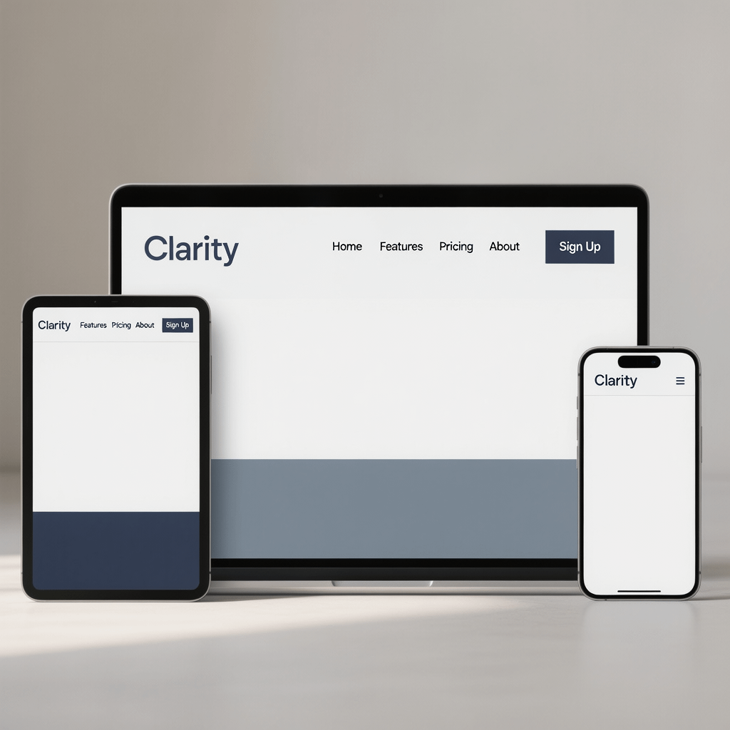
A clean, modern header adapting from desktop to phone. All images are compressed for speed.
Create a Responsive Navbar: 9 Powerful Steps That Work
By Morne de Heer | Published by Brand Nexus Studios
If you need to create a responsive navbar that feels effortless, you are in the right place. This step by step guide gives you the code, patterns, and guardrails to build a clean, accessible header that adapts perfectly to any screen.
You will create a responsive navbar that is fast, semantic, and easy to maintain. We will design mobile first, wire in a small JavaScript toggle, and polish the details that delight users and search engines.
Along the way, you will learn how small choices shape performance and conversions. A lean header helps people find what they need faster, and it makes your brand feel crisp from the first tap.
Why you must create a responsive navbar in 2025
People browse on phones more than ever. If your menu breaks, hides key links, or takes over the entire screen, users bounce. When you create a responsive navbar the right way, you protect UX and revenue.
Clear navigation also supports SEO. A simple structure and consistent internal linking help crawlers understand your site. Good navigation boosts engagement signals too. That is why many high performing sites invest real time here.
If you prefer expert help, website design and development teams at Brand Nexus Studios can deliver a polished header and full site system that scales with you.
Before you code, define success and constraints
Start with goals. Do you want people to view products, book a demo, or read content? When you create a responsive navbar, match labels to these goals. Keep labels short and action oriented.
List your top level links. Then group secondary items into a single More or Services bucket if space is tight. This trims clutter on smaller screens and helps users scan faster.
- Prioritize 5 to 7 top level items
- Keep labels under 16 characters when possible
- Choose a breakpoint based on real content, not guesses
HTML first: the semantic skeleton
Semantic markup keeps things robust. You will create a responsive navbar using a <header> with a <nav>, a logo link, a button to toggle the menu, and an unordered list for links. This structure is resilient and accessible.
<header class="site-header">
  <nav class="nav" aria-label="Main">
    <a class="nav__logo" href="/">YourBrand</a>

    <button class="nav__toggle" aria-expanded="false"
            aria-controls="nav-menu" aria-label="Menu">
      <span class="nav__toggle-bar"></span>
      <span class="nav__toggle-bar"></span>
      <span class="nav__toggle-bar"></span>
    </button>

    <ul id="nav-menu" class="nav__menu">
      <li><a href="/products/">Products</a></li>
      <li><a href="/pricing/">Pricing</a></li>
      <li class="has-sub">
        <button class="sub-toggle" aria-expanded="false"
                aria-controls="services-sub">Services</button>
        <ul id="services-sub" class="sub-menu">
          <li><a href="/services/design/">Design</a></li>
          <li><a href="/services/development/">Development</a></li>
        </ul>
      </li>
      <li><a href="/blog/">Blog</a></li>
      <li><a href="/contact/">Contact</a></li>
    </ul>
  </nav>
</header>
This skeleton lets you create a responsive navbar that stays readable without CSS. Screen readers and bots can traverse it easily, which is exactly what you want.
Base CSS: layout, spacing, and tokens
Keep CSS simple. Use custom properties for colors and spacing. Start mobile first, then scale up. You will create a responsive navbar with Flexbox and a tiny set of utilities.
/* Variables and resets */
:root {
  --nav-bg: #ffffff;
  --nav-fg: #0f172a;
  --nav-accent: #2563eb;
  --space-1: .5rem;
  --space-2: 1rem;
  --space-3: 1.5rem;
}
* { box-sizing: border-box; }
body { margin: 0; font-family: system-ui, -apple-system, Segoe UI, Roboto, Arial, sans-serif; }

/* Header and nav */
.site-header {
  background: var(--nav-bg);
  border-bottom: 1px solid rgba(15,23,42,.08);
}
.nav {
  display: flex;
  align-items: center;
  justify-content: space-between;
  padding: var(--space-2);
  max-width: 1200px;
  margin: 0 auto;
}
.nav__logo {
  color: var(--nav-fg);
  font-weight: 700;
  text-decoration: none;
  font-size: 1.125rem;
}

/* Toggle button */
.nav__toggle {
  background: transparent;
  border: 0;
  cursor: pointer;
  width: 40px;
  height: 40px;
  display: grid;
  place-items: center;
}
.nav__toggle:focus-visible { outline: 2px solid var(--nav-accent); outline-offset: 2px; }
.nav__toggle-bar {
  display: block;
  width: 22px; height: 2px; background: var(--nav-fg);
  position: relative;
}
.nav__toggle-bar + .nav__toggle-bar { margin-top: 5px; }

/* Menu list */
.nav__menu {
  list-style: none;
  margin: 0; padding: 0;
  position: absolute; inset: 64px 0 auto 0;
  background: var(--nav-bg);
  border-top: 1px solid rgba(15,23,42,.08);
  transform: translateY(-10px);
  opacity: 0; visibility: hidden;
  transition: transform .2s ease, opacity .2s ease, visibility .2s;
}
.nav__menu li { border-bottom: 1px solid rgba(15,23,42,.06); }
.nav__menu a, .sub-toggle {
  display: block; padding: var(--space-2) var(--space-3);
  color: var(--nav-fg); text-decoration: none; background: transparent; border: 0;
  width: 100%; text-align: left; font-size: 1rem;
}
.nav__menu a:hover, .sub-toggle:hover { background: rgba(37,99,235,.06); }
.nav__menu a:focus-visible, .sub-toggle:focus-visible { outline: 2px solid var(--nav-accent); outline-offset: 2px; }

/* Submenu */
.has-sub .sub-menu {
  display: none; list-style: none; margin: 0; padding: 0;
}
.has-sub[aria-expanded="true"] .sub-menu,
.sub-toggle[aria-expanded="true"] + .sub-menu {
  display: block;
}

/* Open state */
.nav--open .nav__menu {
  transform: translateY(0);
  opacity: 1; visibility: visible;
}

/* Desktop breakpoint */
@media (min-width: 768px) {
  .nav__toggle { display: none; }
  .nav__menu {
    position: static; display: flex; gap: var(--space-2);
    opacity: 1; visibility: visible; transform: none;
    border: 0; background: transparent;
  }
  .nav__menu li { border: 0; position: relative; }
  .nav__menu a, .sub-toggle { padding: var(--space-1) var(--space-2); width: auto; text-align: left; }
  .has-sub:hover .sub-menu,
  .has-sub:focus-within .sub-menu {
    display: block;
    position: absolute; top: 100%; left: 0;
    background: var(--nav-bg); padding: var(--space-2) 0;
    min-width: 220px; border: 1px solid rgba(15,23,42,.08);
    box-shadow: 0 6px 18px rgba(0,0,0,.06);
  }
}
This mobile first CSS lets you create a responsive navbar that feels native on phones while expanding smoothly on larger screens. It is small, readable, and easy to extend.
JavaScript toggle: minimal, accessible, and fast
Keep the script tiny. We will use event listeners on the button and the submenu toggles. When you create a responsive navbar, the toggle must announce its state with aria attributes and support keyboard input.
<script>
  const nav = document.querySelector('.nav');
  const toggler = document.querySelector('.nav__toggle');
  const menu = document.getElementById('nav-menu');
  const subToggles = document.querySelectorAll('.sub-toggle');

  function toggleMenu() {
    const open = toggler.getAttribute('aria-expanded') === 'true';
    toggler.setAttribute('aria-expanded', String(!open));
    if (!open) {
      nav.classList.add('nav--open');
      menu.removeAttribute('inert');
    } else {
      nav.classList.remove('nav--open');
      menu.setAttribute('inert', '');
    }
  }

  toggler.addEventListener('click', toggleMenu);
  toggler.addEventListener('keydown', e => {
    if (e.key === 'Enter' || e.key === ' ') { e.preventDefault(); toggleMenu(); }
    if (e.key === 'Escape') { toggler.setAttribute('aria-expanded', 'false'); nav.classList.remove('nav--open'); menu.setAttribute('inert', ''); }
  });

  subToggles.forEach(btn => {
    btn.addEventListener('click', () => {
      const expanded = btn.getAttribute('aria-expanded') === 'true';
      btn.setAttribute('aria-expanded', String(!expanded));
    });
  });
</script>
That is all you need to create a responsive navbar that toggles quickly and keeps the DOM clean. Test with keyboard only to confirm the experience is smooth without a mouse.
Breakpoints and layout patterns that scale
Start with one breakpoint around 768px, then adjust based on your labels. Your goal is to create a responsive navbar that remains scannable without shrinking text too far or wrapping awkwardly.
When labels are long, convert one or two items into a catch all dropdown. If everything is crucial, consider a two line header with utility links above the main row.

Accessibility: labels, focus, and ARIA
Accessibility is not optional. You must create a responsive navbar that is usable by keyboard and screen reader users. Use a real button for the hamburger, set aria-controls to the menu id, and toggle aria-expanded properly.
- Provide visible focus outlines for links and buttons
- Use logical tab order and test with Tab, Shift Tab, and Escape
- Ensure color contrast meets WCAG AA

Design tips to create a responsive navbar people love
Make the logo clickable and keep it left aligned for quick home access. Ensure the toggle button has a clear label like Menu. When you create a responsive navbar, consistency across pages matters more than flair.
Use generous tap targets at least 44px tall. Provide active state styles, and consider a subtle underline on hover to reinforce affordance. Keep the header height compact so content stays in view.
Navigation content strategy that supports SEO
Good navs guide users and bots to your most valuable content. Include product, pricing, and proof points like case studies. If you create a responsive navbar with shallow nesting, crawlers will access key pages faster.
Structured links also pass authority across your site. Pair this with solid SEO services to reinforce relevance and improve internal linking discipline.
Performance: lean CSS, minimal JS, caching, and image compression
Headers load on every page, so they must be light. Inline critical CSS for the header, defer non critical JS, and keep dependencies out. You will create a responsive navbar that ships fast by cutting bytes ruthlessly.
Enable browser caching on static assets and compress images with modern formats. Even UI images, like a small logo or icon set, benefit from compression. Mentioning it here reminds your future self to do it.
To go further, consider a CDN, preconnect to your font host, and limit layout shifting. Small wins stack up and your visitors will feel the difference immediately.

Advanced patterns: sticky headers, mega menus, and search
When you create a responsive navbar with a sticky header, use position sticky with top set to zero. Keep shadows light and avoid reducing viewport height too much on mobile.
Mega menus handle large catalogs. Use headings, short descriptions, and a simple grid. For accessibility, keep the structure linear in the DOM and use focus management carefully.
If search is key, place the icon in the header and open a lightweight modal that focuses the input. This keeps the header tidy while making search one tap away.
Frameworks or custom code to create a responsive navbar
Frameworks like Bootstrap or utility libraries like Tailwind can speed up delivery. If you need to create a responsive navbar quickly, they are solid options.
Custom code is usually smaller and easier to brand. If your team supports a design system, a bespoke navbar often pays off long term because it contains only what you need.

Quality assurance checklist to create a responsive navbar
Use this checklist before release. It helps you create a responsive navbar that is stable, usable, and consistent.
- Keyboard only navigation works for all links and toggles
- Hover and focus styles meet contrast guidelines
- Menu opens and closes with Escape, Enter, and Space
- Active page state is visible
- Header does not block content or overlap modals
- Breakpoints handle long labels and translations
- Logo file is compressed and cached
- No layout shift when fonts load
Analytics: measure impact and iterate
Track clicks on top level items and key dropdown links. When you create a responsive navbar, analytics show what users value and where they hesitate.
Set events for menu opens, submenu toggles, and search initiations. Combine this with analytics and reporting dashboards to guide improvements over time.
Real world example: put it all together
Below is a compact demo that you can paste into an HTML file. Use it to create a responsive navbar for a real project. Tweak tokens and spacing to fit your brand.
<!doctype html>
<html lang="en">
<head>
  <meta charset="utf-8">
  <meta name="viewport" content="width=device-width, initial-scale=1">
  <title>Demo - Responsive Navbar</title>
  <style>
/* Add the CSS from the Base CSS section here */
  </style>
</head>
<body>
  <header class="site-header">
    <nav class="nav" aria-label="Main">
      <a class="nav__logo" href="#">Acme</a>
      <button class="nav__toggle" aria-expanded="false" aria-controls="nav-menu" aria-label="Menu">
        <span class="nav__toggle-bar"></span>
        <span class="nav__toggle-bar"></span>
        <span class="nav__toggle-bar"></span>
      </button>
      <ul id="nav-menu" class="nav__menu">
        <li><a href="#">Home</a></li>
        <li><a href="#">Products</a></li>
        <li class="has-sub">
          <button class="sub-toggle" aria-expanded="false" aria-controls="sub-1">Services</button>
          <ul id="sub-1" class="sub-menu">
            <li><a href="#">Design</a></li>
            <li><a href="#">Development</a></li>
          </ul>
        </li>
        <li><a href="#">Blog</a></li>
        <li><a href="#">Contact</a></li>
      </ul>
    </nav>
  </header>

  <main>
    <h1>Welcome</h1>
    <p>Your content goes here.</p>
  </main>

  <script>
/* Add the JavaScript from the JS Toggle section here */
  </script>
</body>
</html>
Swap in your brand tokens, then create a responsive navbar that blends into your design system. Keep iterating based on user behavior.

Pitfalls to avoid when you create a responsive navbar
Do not hide important pages under deep dropdowns. Avoid massive overlays that trap scroll. If you create a responsive navbar that feels pushy or clunky, people will bounce.
Resist heavy animations and large icon sets. Keep the header height compact. Test on a mid range Android phone. If it feels slow there, it will feel slow everywhere.
When to bring in a partner
Teams move faster with experts who have solved the same problems many times. If deadlines are tight, Brand Nexus Studios can help you create a responsive navbar, ship a modern site, and keep it fast on every page.
Explore our managed website packages to bundle strategy, build, and care. Your header, hosting, and updates can be covered in one plan.
FAQs
What is the easiest way to create a responsive navbar?
Start with semantic HTML and Flexbox, add one breakpoint, and use a small toggle script. Keep labels short and test with a keyboard and a phone.
Should I use a framework to create a responsive navbar or custom code?
Use a framework if you need speed and consistent patterns. Go custom if you want a smaller bundle and tight branding. Both can work well.
How do I make the toggle accessible when I create a responsive navbar?
Use a button element, aria-controls to point at the menu id, and aria-expanded to reflect state. Support Enter, Space, and Escape keys.
What are common mistakes when people create a responsive navbar?
Overcrowded menus, low contrast, missing focus outlines, and animations that cause jank. Also, bloated libraries that slow the first render.
Does a responsive navbar affect SEO?
Yes. Clear navigation improves UX and crawl paths. Combine it with strong internal linking and reliable page speed for the best results.
How many items should I keep at the top level?
Usually 5 to 7. If you have more, group related links under a concise dropdown so scanning stays quick on mobile.
How can I track if users find what they need?
Track menu opens, link clicks, and search starts. Compare desktop vs mobile behavior and adjust labels based on actual usage.
Wrap up: create a responsive navbar that feels invisible
When you create a responsive navbar that is simple, fast, and accessible, it fades into the background while users focus on your content. That is the mark of good design.
If you want a partner who cares about the full experience from navigation to hosting, Brand Nexus Studios can guide strategy and delivery without the bloat. We handle builds, performance, and care plans so you can stay focused on growth.
Have questions or tips to add about how you create a responsive navbar for your stack? Drop a comment, share this guide, or email us at info@brandnexusstudios.co.za. If you want help with the bigger picture, our social media marketing services and site builds can round out your growth engine.
References
About the Author